Glad
Conceptual brand platform
(not selected for production)
2025
fcb chicago
This conceptual brand campaign explores a modular design system for Glad centered around the idea: Ditch the Madness. Find Gladness. Rather than reinventing the brand, the objective was to build on Glad’s existing equity by amplifying its iconic yellow palette, introducing more expressive typography, and pairing it with playful lifestyle photography to create a system that feels more energetic, relatable, and emotionally engaging.
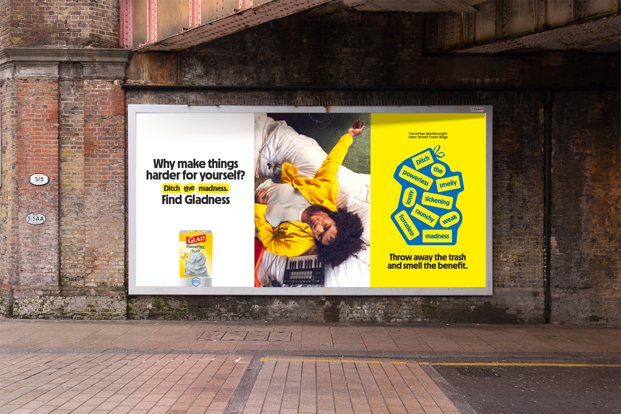
The campaign reframes waste as an unavoidable part of everyday life, but not something that needs to define it. By spotlighting product features like ForceFlex technology, odor-masking fragrances, and vibrant-colored bags, the creative direction shifts the conversation from managing mess to making it easier to move past. The result is a flexible visual system designed to celebrate how Glad helps people spend less time thinking about trash and more time living.
Platform headline lockup
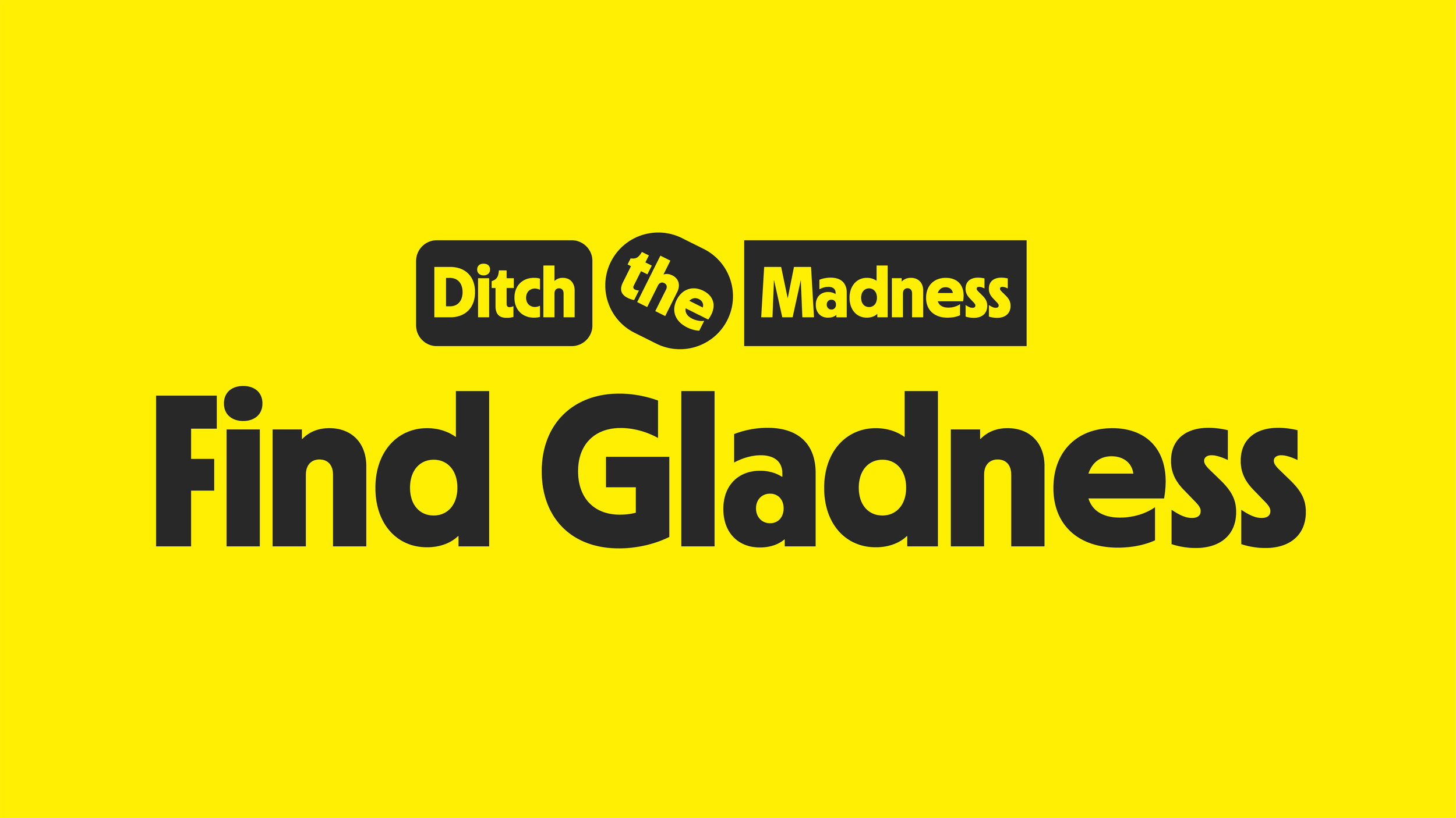
For the “Ditch the Madness. Find Gladness.” platform line, I created a custom headline lockup that visually reinforces the campaign’s message. I placed “Ditch the Madness” into separate graphic shapes, symbolizing pieces of waste being tossed out. The word “the” is intentionally tilted, giving the impression that it’s been thrown away—adding a touch of playfulness and reinforcing the idea of letting go of the chaos.
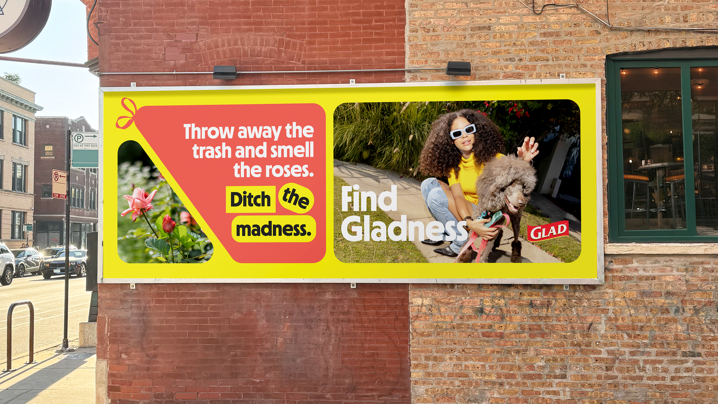
The Trash Bag as a Design Element
I explored how to make the trash bag itself an ownable graphic asset within the brand system. By adding the iconic tied top of a trash bag to a bold shape, it instantly became a modular form that could adapt across applications while also becoming a visual shorthand of the product.
These shapes were designed to flow naturally with imagery, reinforcing the idea that our trash bags are part of daily life, but doesn’t have to dominate or disrupt it. I allowed the bags to shift into different geometric forms, subtly nodding to Glad’s ForceFlex technology.
Paired with lifestyle photography of people enjoying life, taking deep breaths, or simply living without worry, the system communicates a world where waste doesn’t get in the way. I kept the overall look minimal, streamlined, and just a touch playful, ensuring the design felt approachable while staying true to the core strategy of transforming the unpleasant into the empowering.

expanding the system for press’n seal
To test the flexibility of the design system, I extended the visual language beyond trash bags and into Press’n Seal. While the platform line embraces the idea that waste is an inevitable part of everyday life, the Press’n Seal product reframes that same philosophy through prevention of waste.
Using the cling wrap itself as a modular graphic device, the visual system shifts from bags fitting in with life to cling wrap layering over imagery, showing how Glad helps extend the life of food before it becomes waste. The result maintains the playful composition, and optimistic tone of the broader system while giving Press’n Seal its own purposeful role within the brand story.
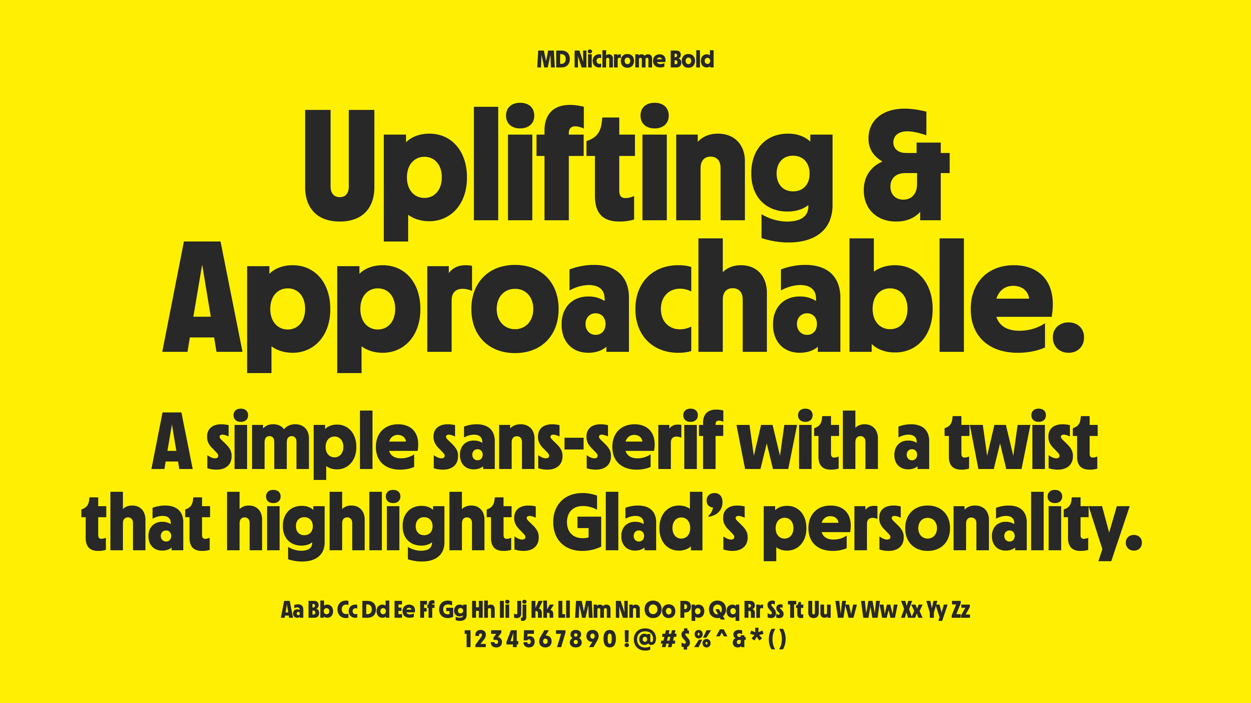
typeface Selection
As part of evolving the Glad brand system, I made the decision to shift the headline typeface from Poppins to MD Nichrome. Inspired by the playful nature of the 1970s and 80s, MD Nichrome felt like a natural fit. Not only because of its distinctive, confident energy, but also as a nod to Glad’s founding year of 1978.